Unleash the power of mLearning
Stop tethering your employees to their desks! It’s the 21st century; learning should be as mobile as they are.
Mobile learning, or mLearning, frees your workforce to access training anytime, anywhere, on any device. This translates to increased engagement, improved knowledge retention, and – let’s be real – a workforce that’s actually excited about mobile training. ThinkingKap builds dynamic mobile learning solutions that deliver real results.

ThinkingKap’s approach
At ThinkingKap, we don’t just shoehorn your existing training content onto a smaller screen and call it mLearning.
We craft immersive, engaging experiences specifically designed for how people actually use mobile devices. All of our eLearning courses are available on mobile devices – phones, tablets, you name it – but sometimes, you need an experience tailor-made for life on the go. That’s where our mobile-first approach comes in.
Strategize and design your mobile learning experience
We work closely with you to understand your audience, their needs, and how mobile learning fits into their workflow. We then design intuitive, interactive courses that leverage the strengths of the mobile platform, whether it’s a quick micro-learning module or a comprehensive training program.
Develop and deploy
From there, we build out the mobile training using cutting-edge authoring tools and best practices for mobile usability. The final product? A seamless, engaging learning experience that your team can access anytime, anywhere, leading to better engagement and tangible results.
We work with a very diverse customer base, and it turns out most users access our materials from their phones. ThinkingKap helped us identify the most appropriate way to deliver our training to mobile devices. We knew there was a huge challenge communicating our complex material on tiny phone screens, but the design and approach ThinkingKap came up with was just perfect. The course is easy to use and understand, and people love it!
Benefits of mLearning
Ditch the outdated, one-size-fits-all training methods.
mLearning empowers your workforce to learn at their own pace, on their own time, and in the environments where they learn best. This personalized approach translates to increased engagement, improved knowledge retention, and ultimately, a more knowledgeable and adaptable team.
Bite-sized learning, maximum impact
Our mobile learning courses are designed for the modern learner with short attention spans and busy schedules. We deliver easily digestible content in concise, focused bursts, maximizing engagement and knowledge absorption.
Cultivates a culture of learning on mobile
Mobile learning makes training accessible anytime, anywhere, fostering a culture of continuous learning within your organization. Employees can easily integrate learning into their workflows, leading to improved skills, increased confidence, and a more engaged and future-ready workforce.
Mobile learning in action

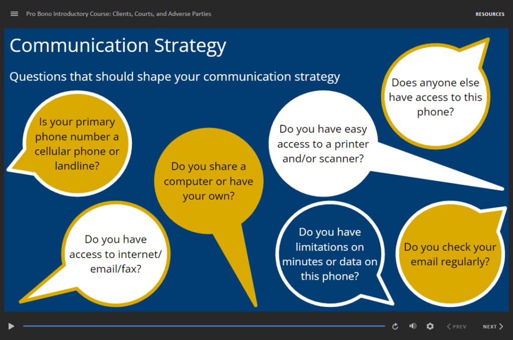
Georgia needed to educate residents and train pro bono attorneys on foreclosure. Discover how targeted eLearning empowered both groups. ThinkingKap developed eLearning courses that received highly positive feedback, and significantly benefitted the residents who participated. Read our case study,
Examples of mobile learning
Mobile learning opens up a world of creative and engaging learning experiences.
At ThinkingKap, we tailor our mLearning solutions to meet the unique needs of your workforce and deliver captivating learning moments right to their fingertips. So, what is mobile learning?
Microlearning modules: knowledge in short bursts
Our microlearning modules provide quick hits of information that learners can easily consume on the go. These short, focused mobile learning lessons reinforce key concepts, introduce new information, and boost knowledge retention in a way that fits seamlessly into even the busiest schedules.
Interactive videos: see it, hear it, remember it
Videos aren’t just for passive watching anymore. We create interactive video experiences that captivate learners with embedded quizzes, clickable hotspots, and branching scenarios, transforming mLearning into a dynamic and memorable experience.
Performance support tools: guidance when they need it most
Imagine your workforce armed with instant access to just-in-time training, how-to guides, and interactive simulations – exactly when they need it most. Our mobile learning corporate training solutions do exactly that, transforming their devices into powerful tools that boost productivity and performance in real-time.
Why ThinkingKap?
Experts in mobile learning services
Tired of mobile learning corporate training solutions that feel clunky, boring, or just plain bad? You’re not alone. At ThinkingKap, we live and breathe mLearning, blending cutting-edge technology with a deep understanding of adult learning principles to create mobile-first experiences that actually work.

Stunning visuals that captivate and engage
We don’t just design courses; we craft immersive learning environments that grab attention and refuse to let go. Our team of eLearning graphic design gurus knows exactly what it takes to transform your content into visually stunning mobile learning experiences that are as captivating as they are effective.
Mobile learning that delivers real results
What good is a beautifully designed course if it doesn’t deliver results? That’s why we obsess over every detail of the learning experience, from intuitive navigation and engaging interactions to carefully crafted assessments that measure true understanding.
With ThinkingKap, you’re not just getting a pretty package – you’re getting a powerful tool for driving meaningful change within your organization.
Don’t let your training get left behind in the digital dust.
FAQs
We love answering questions about mLearning!

Okay, you’ve convinced me. How do I get started with mLearning? (Asking for a friend who’s glued to their phone.)
You’ve come to the right place! Hit that “Talk to an Expert” button, and our mLearning gurus will help you create a learning experience that’s as mobile as your workforce.

Talk to an expert
Start your mobile learning project today!
Don’t let your training get left behind in the digital dust. Partner with ThinkingKap to create cutting-edge mLearning experiences that engage your workforce and drive real results. Give us a call at 1 (800) 38-THINK or use the form to get started.
