This post is part of an eight-part series on graphic design for eLearning. You can look for this series every other Thursday here on our blog (and sharpen your skills with each and every post.)
With that said…
We’ve talked before about graphic design as a whole for eLearning development, but today, we’re going to focus in on one specific topic: The importance of using crisp graphics and hi-resolution photos in your eLearning course.
First, let’s talk about why visuals are important to any eLearning course.
Visuals and Memory
Visual information is vital for memory and recall. In fact, some research shows that images are much more memorable than written or spoken information. One study showed that after 72 hours, only about 15% of written or spoken material was retained in comparison to 65% of visual data.
Faster Learning
Visuals also help by speeding up the information transmission process. How do we know that? Studies show that the human eye can register 36,000 visual messages per hour and that visuals are processed 60,000 times faster than text. Plus, 90% of the data that goes through to our brains is visual.
So since we know how important visuals are to your eLearning course, let’s look at how you can ensure you’re delivering the best visual data that you can.
Hi-Res Graphics
Graphic design for eLearning needs to stick to three main objectives:
Simplicity. Think about people who thrive from their design departments: Apple and Nike. What do they have in common? Simple, clean design.
Cohesiveness. Your graphics should compliment the material and be consistent throughout the course to create a sense of uniformity and professionalism.
Communication. The main objective of your graphics is to help learners understand concepts. Make sure they are adding to the course, not distracting from it.
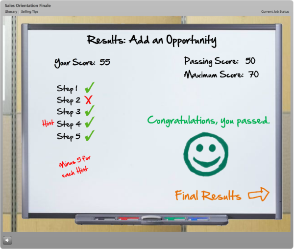
Example: Take a look at this Articulate Storyline award-winning course we designed for sales training. Notice how there’s cohesiveness to the graphic characters, whiteboard/corkboard elements, and general tools? All of these work together to make the course more effective.


 Now let’s look at the photo side of design.
Hi-Res Photos
Often times, you’ll need to incorporate photos or screenshots to make your eLearning course more applicable to real-life scenarios. When using photos, remember to choose images that are:
-Sized slightly larger than they will be in the course to reduce pixilation
-Not overcrowded with visual information
-Highly relevant to the material
Let’s zoom in for a moment on that first concept. Sizing is a balancing act.
You never want to use an image that starts smaller than you plan to use it in your course. While Minecraft may be the rage, you don’t want your eLearning photos to look like that. So, never use a blurry image you pulled from Google search.
On the flip side, while some will tell you to use the largest image you can find, if your course will be viewed by any mobile users, this will create bandwidth issues for your user. Large files over unknown mobile connections is not a good mix. This is why we suggest images are exactly, or only slightly larger than you will display them.
To find those, here are a few free sources of beautiful, hi-res images you can use:
Always be sure to check the licensing on your image before incorporating, as there may be a commercial use limitation.
Graphic Design for eLearning: Leverage Images
Those who do solid graphic design for eLearning will have learners who reap the benefits: They learn more quickly and retain concepts longer. Remember: Always use design to enhance—never to distract.
